Wednesday 26 October 2011

Part two - Reference Material & Achievement, & Reflective Commentary

Reference Material used for Assignment two


List of books owned or on loan from the local library

  • Johannes Itten's Book - The Elements of Colour
  • Karin Jerstorp & Eva Kohlmark - The Textile Design Book (understanding and creating patterns using texture, shape and colour)
  • Emma Brigs  - Mosaic Techniques
  • Kerry Skinner  -  The Painted Room
  • John Gillow and Bryan Sentance - A Visual Guide to Traditional Techniques WORLD TEXTILES
  • Kay Greenlees - Creating Sketchbooks For Embroiderers And Textile Artists
  • Thomasina Beck - The Embroiderer's Garden
  • Lynette de Denne - Creative Needlecraft
 What have you achieved?


Do you feel you made a good selection from your drawings to use as source material for your designs idea? Which interpretations worked best; can you say why?

I think the drawings I selected were a good choice for my materials. The simple daisy flower on project 5 stage 4  worked really well, the tension came really well from the hand painted marks and the block printing gave depth and even a slight 3 dimensional effect.
The kaleidoscope design on project 5 stage 4 I really loved, It was a design I could have played around with for hours. it had strong graphics, plenty of contrast in the colours also plenty of tension.


Which fabrics did you choose? What particular qualities appealed to you?

I chose poplin cotton,hessian & voiles. The cotton worked well because it made the colours stand out. Hessian I used for the Tulip kits (French knots) Stage 5 & Stage 6.
The voiles I used to experiment on project 4, I used block printing - gold fabric paints on this and it came out very faint. I was disappointed with this, but when I go back to it now it has grown on me. I see more in it, it's very delicate and would look very feminine against your skin if you were wearing it in an outfit.

Is the scale of marks and shapes on you samples appropriate to the fabric? 

Yes I think so, I was happy with them.


Would any of your ideas work better on a different type of fabric, for example, sheer, textured, heavyweight? Why?

No, I don't think so. I will try more experiments on the different fabrics maybe using textured or heavyweight as a background (things to try!)
I would have loved to use padding & stitching on some of the larger projects but did feel it would distract from the original assignment.


Do the marks and shapes seem well placed, too crowded or too far apart?

The way I read the exercise at first it came across not to worry about placement.This was my first attempt at this sort of fabric printing so I was quite please at how they came out. There is room for improvement, project 5 stage 3 is an example - it was a bit blotchy in places, but I did learn pva glue stops the paint from running.


Were you aware of negative shapes that were forming between the positive shapes?

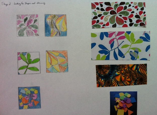
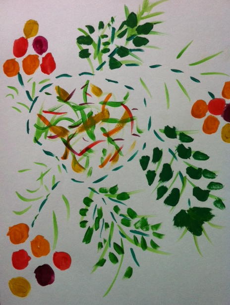
I came across this on Project 4 stage 2 - exercise 1, I had to have a few goes at positioning the leaves, it was the negative white space around them.


What elements are contrasting and what elements are harmonizing in each sample? Is there an interesting tension?
  • Project 4 - Stage 3 (Vase) I think this really has harmony, the colours blend well together, the tension is low key in the middle of the piece. It contrasts very well together.
  • Project 4 - Experiment with block printing (using sticks & gardening tool). Even though I just used the one colour it had plenty of tension, you just need to look into the printed long strips (especially where the tree strips meet) and you can see lots of tension marks. Even the smaller printed areas had tension. It did harmonize together with the bronze print & cream background.
  • Project 4 - Experiment with relief printing (using a old laced pillowcase & string). This had great tension, lots of little marks made by going into the little lace holes with the paint.It contrasted well by using the string to separate the lace section which made it harmonious.
  • Project 5 - stage 3 This piece has bucket fulls of tension around the edges where the paint came through and have extra marks that should not be there. This piece has very strong contrasts, so not a harmonious piece.
  • Project 5 - Stage 4 (Daisy Design). The pattern & colour has great contrast & harmonizes well together. The slight tension is in the hand painted brush strokes coming off the large daisy.
  • Project 5 - Stage 4 (Snowdrop). I think the tension for me on this design is the lighter green faint brush strokes. It has a very strong contrast and I feel the colours don't have the harmony as much as the above pieces.
  • Project 5 - Stage 4 (Kaleidoscope effect). I love this design you could see the design could continue on and on repeating it's self (e.g make a large duvet cover). it contrasted well with plenty of tension for example the green marks over the yellow, the white marks on the little green flowers these are just a few. Even though the colours are bright and cheerful they harmonized well together.
How successful do you think your larger sample is? Do you like the design? Have you recreated or extended your ideas from smaller samples so that there is a visual development between the two?

My large sample (Kaleidoscope design) was worked from Project 4 - Stage 4 bottom middle. I love this design, I think it was a good attempt to recreate the design also extend the design further (the next bit that you couldn't see!)  


Reflective Commentary


I've really enjoyed Assignment two, It's all been a steep learning curve because I had never done anything with fabric paints before. I just hope it's good enough!
The mixing of paints was such a joy, I didn't take art as a subject at school and I really wish I had done, mixing the paints was so much fun!.
The design work in the exercises could create endless possibilities of work.
Should I have used more different fabrics? - this I wasn't sure about maybe I should have checked, I was please with what turned out on the fabrics I used.
I am just a little concerned about the amount of work I do (am I doing enough) with having a full time job & being a carer at home. I find I spend much more time than the recommended time scale (French knot sample is a example).The time spent is not an issue, I love working on my samples.
I concentrated on techniques which were talked about and I think it will be interesting to have a go and explore different textures & fabrics in due course. I am wondering is the work I am doing varied enough for assessment when the time comes around?


    Project 5 - Stage 4 A Large Sample

    Block & Hand printing

    Project 5 - Stage 4

    I used block & hand printing on this project. First of all I cut two pieces of wood, then cut out polystyrene shapes and glued these onto my wood. One of the shapes was a circle and the other was like a shape of a leaf. this then allowed me to create my flowers from the sketch. I then hand painted the extra marks on the fabric.

    Stencil painting
    This design was taken from the vase in project 4 - exercise 4. I made nine copies of the sketch then cut out different sections on the design so I could use different colours and repeat it. I was please with how this result came out.


    Stencil  & Hand Painting
     I worked this design from my kaleidoscope ideas on Project 4, Stage 4 (Developing design ideas). I attempted to recreate the effect on fabric. I could see that I could have repeated the pattern on and on. I did make an error of getting the fabric stuck to paper (it went through the material more than I expected - I will use different protection next time). I think this was a sucsess.

    Project 5 - Stage 3 Printing and painting on fabric


    Stencil printing
    Project 5  -  Stage 3

    First of all I chose one of my designs and decided to do stencil painting on it.
    I drew the design out on card, the used my stanle knife to cut out sections that I was going to paint.When I did paint onto the material I seemed to have one or two blobs on the edge but I think this was down to my edges not being sharp enough on the card or not enough PVA glue in the paint.

    Project 4 - Stage 4 Experiments with printing and painting


    I used stencils for the above print, I found it rather hard to make sure you didn't make the paint run into one another. I was pleased with the result. It did take time for the paint to dry in between the layers.I also hand painted the middle section.

    Block Printing


    The next experiment I used Block printing, I had some pieces of wood also a garden tool for potting. I also learned that adding PVA glue to the fabric paints stops it from running on the material.

    Relief printing
    I really enjoyed the relief printing, I used some laced material off an old pillow case then used string to go though the lace.

    Block printing
    This was a experiment on fine silk material, I thought it didn't turn out that well but the more I look at it I'm changing my mind. It has plenty of depth and energy the more you look at it.

    Project 4 - Stage 4 Developing design ideas


    Project 4 - Stage 4


    Stage 4 - Developing design ideas

    This exercise took more hours than expected. I chose my design - which was the easy part, then set about finding a computer program to get my different effects. I used a Kaleidoscope program then played around using different bits from the original first effect.

    Monday 24 October 2011

    Project 4 - Stage 2 Exercise 4

    Stage 2 - Exercise 4


    Stage 2   -  Exercise 4

    I decided to draw and work on two vases, the frilly top vase (left) is mine and the other one is my mother-in-laws.
    I love the curvy neck on my vase, its very much like a frilly skirt.The soft brown colours down the vase really blend well together.
    The older vase is more striking/bold design with plenty of energy.

    Project 4 - Stage 2 Exercise 3

    Stage 2 - Exercise 3


    Stage 2  -  Exercise 3


    • The first (top left) drawing I used acrylic paints (which came out darker than I really wanted).
    • The second (bottom left) I used watercolours which gave me a softer mood fairly static and less tension.
    • The third (top right) I used some net knitting wool that I had left over from a scarf. I thought this gave it energy and dynamic.
    • The fourth (bottom right) I used crayons, this had energy but didn't stand out to me the same as the pink did in previous exercise.

    Project 4 - Stage 2 Exercise 2

    Stage 2  - Exercise 2


    Stage 2 -  Exercise 2

    I love the colours in this design, pink is one of my favourite colours, the big splash with the black over the top really comes alive and vibrant.I did change the drawing slightly by adding extra gray marks which I think adds more to the mood of the design.It gives it more tension.

    Project 4 - Stage 2 Exercise 1

    Stage 2 - Exercise 1


    Project 4 - Stage 2 Exercise 1


    This design was taken from my mixed up wallpaper. The first drawing I made marks using 2H, HB and 8B pencils I shaded the mistletoe leaves very dark to give the dynamic effect, the lighter pencil just gave the tension that was needed.
    The second design I used crayons which seemed to calm the design. I changed the pink to the red because I didn't have a pink crayon. I think this stood out more but when I added the grey it calmed the red.
    The third design I used green paper which altered the design again (you eyes are drawn the the green). I then used orange tissue paper and crayoned over the top of it which gave you lines on the tissue.
    So when you look at the design the green & orange-red create the dynamics and energy.

    Project 4 - Stage 2 Looking for Shapes and drawing

    Project 4 - Stage 2


    Project 4 - Stage 2  (Looking for shapes and drawing)

    I experimented with different designs from wallpaper, I enjoyed mixing them up to arrange the different shapes.I loved how the mistletoe leaves mixed with the petal shape wallpaper. I coloured the designs which made them very dynamic and full of energy.

    Project 4 - Developing design ideas


    Project 4 - Stage 1 (Introduction and preparation)

    I concentrated first with placing lines and squares in different positions to change the visual energy of the boxes. I created Dynamic, Static, Tension & Energy arrangements.
    The bottom right hand corner I think is the most peaceful with the one long line crossed by a very small line (it just slightly interrupts the energy and creates a small amount of tension.
    The top left and middle are very dynamic and full of tension, they make you scan your eyes all around them, where top right is very static with lines of symmetry.

    Sunday 23 October 2011

    Project 3 - Research Point


    My Wedding Dress - From Barbados
    Project 3 - Research Point

    The piece of textile shown in the pictures is my wedding dress. I bought it in Barbados (February 2002) we got married in the August 2002 (so not weight gain was allowed!). Mum, Dad and I were looking for children's t-shirts when we found this shop with wedding dresses, this one was just me.
    The dress is just over 3/4 length and is lined throughout. It is full flowing silk with lace over the top half of the body. The colour is Ivory, the lace has been done by machine (you can tell because it is very firm) and it has very fine roses up the body and like a V on the edges with little round flower. The lable has Fashion May Queen - made in the USA.
    The dress is very special to me because I wore it on our Wedding day 9 years ago. It was a beautiful dress to ware because it has a heavy weight about it and it flowed with elegance,

    Project 3 - Review


    Review of Project 3 work
    Project 3 - Review

    Were you able to mix and match colours accurately?
     Yes I did find it ok to mix the colours accurately, orange/red were a bit tricky but I felt I did persevere.
    Were you able to use colour expressively?
    Not sure, I think so.
    I followed the brief which at times I had  to read a few times over to understand what was needed in the exercises. Some were more difficult than others. 
     Can you now see colour rather than accepting what you think you see?
    Yes, Johannes Itten's book "The elements of colour" was a great help with mixing colour with the eye and the effect it has on other colours.
     Did you prefer working with watercolour or gouache paints?
    I used acrylics and watercolour.. My favourite was acrylics because they mixed better for the brighter colours. Watercolours were good for static and expressing moods and soft colours.
    How successful were the colour exercises in stage 5? How did they compare to the painting exercise?
    I would say "moderate success" - My colours were Red & Yellow on a black background and when you look at it in different angles you can see orange.
    I did prefer painting for experimenting with the colour because it was easier to mix the colours and paint does have more versatility.
    Is there anything you would like to change or develop?
    I would like to try the Gouache paints to see what the difference is? 

    Project 3, Stage 6 - Exercise 2

    Pastel French Knots -Tulip Kites


    Stage 6 - Exercise 2

    This exercise was a joy to do, even though it did take hours!. I did learn that colour mixing with dots needs to be very subtle, the smaller the dots the better the effect and they do mix better. You could see the hue over the different pastel colour tulips when you changed colours.

    Project 3, Stage 6 - Exercise 1

    Red & Green French Knots


    Stage 6 Combining textures and colour effects


    When I started this exercise I searched the Internet for information on Georges Seuret. His paintings were beautiful, the way the colours integrated together.
     I used thick red wool to start off with (which came across chunky) then I added ribbon followed by threads, which made the french knots smaller. Even though there were no gaps it did give a colour change.
    When I added the green mohair wool it did give off a blue tinge.

    Project 3 Stage 5 Colouted Stitches


    Stage 5 - Coloured Stitches

    I found with this stitch sample that the black background really made the colours stand out especially the yellow. I found that if you have a lot of one colour for example the large stitches in red, it then pushes the yellow to the background.
    If the colours are close together they do appear to be mixing together.

    Thursday 20 October 2011

    Project 3, Stage 4 - Exercise 2

    Stage 4 - Exercise 2

    The colour mood that I am really drawn to is the colours I experienced when I visited the Grand Canyon (USA). These colours were amazing and have lived in my mind ever since. This exercise was ideal to put it all down on paper and experience them again.


    I thought it would be great fun to have a go with my favourite mood colours, it seemed a shame to waste them as they were already mixed. It shows how different designs affect the colours. The deep red on the blanket makes the yellow look 3D.

    Stage 4 Colour Moods and Themes

    Noisy - Excited

    Quiet - Calm

    Warm - Cold

    Happy - Light -Dull


    Stage 4: Exercise 1

    I had loads of fun playing around with the colours to create my different moods.

    Project 3, Stage 3 - Exercise 4

    Stage 3 - Exercise 4


    Stage 3: Exercise 4

    This was a interesting project, I couldn't believe how many colours I could see. With being on a blue background it seemed to reflect the blue on the apple & lime. The banana showed different green's red, brown & blue round the edges. The eye certainly looks at things differently know.

    Tuesday 18 October 2011

    Project 3, Stage 3 - Exercise 3

    Stage 3 - Exercise 3

    The postcard that I used was one that friends had sent from Brugge in Belgium. It was enjoyable mixing the correct colours. I had to think hard and draw on what I had learnt from the previous exercises.

    Project 3 Stage 3 - Exercise 2

    Stage 3 - Exercise 2

    I loved this exercise, having to mix the correct colour to the material. It made you do lots of testing to get near the colour, but with all the practice on the previous exercise gives you the confidence to mix well, which made it a very enjoyable experience.

    Project 3, Stage 3 Recording Colours Accurately


    Stage3 Exercise 1


    I used Acrylic and watercolour paints for the above exercise. I could have gone on for a long time mixing the paints, it was a lovely exercise to do. I found watercolours a softer/lighter colour  when mixing. When I mixed darker colours I used the black to deaden the colour. Complementary colours do have more life when they are mixed together.