Sunday, 23 October 2011

Project 3 Stage 5 Colouted Stitches


Stage 5 - Coloured Stitches

I found with this stitch sample that the black background really made the colours stand out especially the yellow. I found that if you have a lot of one colour for example the large stitches in red, it then pushes the yellow to the background.
If the colours are close together they do appear to be mixing together.

Thursday, 20 October 2011

Project 3, Stage 4 - Exercise 2

Stage 4 - Exercise 2

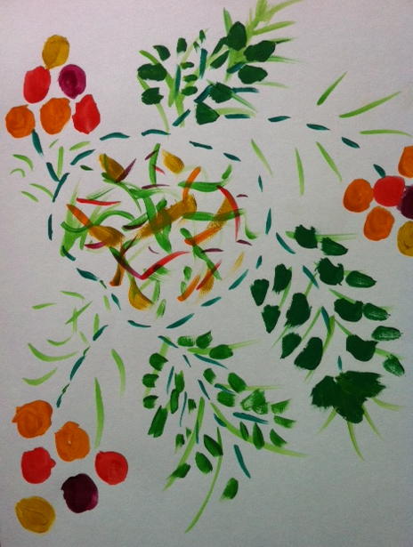
The colour mood that I am really drawn to is the colours I experienced when I visited the Grand Canyon (USA). These colours were amazing and have lived in my mind ever since. This exercise was ideal to put it all down on paper and experience them again.


I thought it would be great fun to have a go with my favourite mood colours, it seemed a shame to waste them as they were already mixed. It shows how different designs affect the colours. The deep red on the blanket makes the yellow look 3D.

Stage 4 Colour Moods and Themes

Noisy - Excited

Quiet - Calm

Warm - Cold

Happy - Light -Dull


Stage 4: Exercise 1

I had loads of fun playing around with the colours to create my different moods.

Project 3, Stage 3 - Exercise 4

Stage 3 - Exercise 4


Stage 3: Exercise 4

This was a interesting project, I couldn't believe how many colours I could see. With being on a blue background it seemed to reflect the blue on the apple & lime. The banana showed different green's red, brown & blue round the edges. The eye certainly looks at things differently know.

Tuesday, 18 October 2011

Project 3, Stage 3 - Exercise 3

Stage 3 - Exercise 3

The postcard that I used was one that friends had sent from Brugge in Belgium. It was enjoyable mixing the correct colours. I had to think hard and draw on what I had learnt from the previous exercises.

Project 3 Stage 3 - Exercise 2

Stage 3 - Exercise 2

I loved this exercise, having to mix the correct colour to the material. It made you do lots of testing to get near the colour, but with all the practice on the previous exercise gives you the confidence to mix well, which made it a very enjoyable experience.

Project 3, Stage 3 Recording Colours Accurately


Stage3 Exercise 1


I used Acrylic and watercolour paints for the above exercise. I could have gone on for a long time mixing the paints, it was a lovely exercise to do. I found watercolours a softer/lighter colour  when mixing. When I mixed darker colours I used the black to deaden the colour. Complementary colours do have more life when they are mixed together.